During year 13 A2 work we looked at narrative theorists such as Todorov, Roy Stafford, Gill Branston, Propps etc. When looking at what narrative theorist could apply to my trailer I think Roy Stafford could as his theory was looking at not giving away the plot and making the audience think about it. My trailer I want to only give quick shots of the film so it's like a puzzle that the audience have to work out themselves.
Another theorist, I would like to think my trailer/film could follow todorov theory as in having a clear stage of everything is okay at the start, then a problem occurs, then repairing the problem. But I think I want my trailer to tell that so the audience can understand the concept of the film but i will also mislead the audience and make them want to find out more. Wanting them to expect the unexpected.
Friday, 30 November 2012
Poster Anaylsis
Looking at inspirations of poster designs for my film here are some posters

This poster has the film title written down the side in capital writing in red, this could resemble blood and death. It stands out from everything as majority of the poster is black. They use the daughter in the background of her in her outfit of when she is being sold to show a part of the film and to remember the audience why her dad is chasing after people. She is faded in the background maybe reflecting his relationship to his daughter fading away and the more time which passes she is becoming more distant. The main picture used is of him running showing what he is mainly doing through out the film.
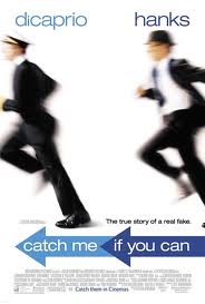

This poster has the actors under their names at the top to show who is in their film. A white background is used and this makes the actors stand out as they are in black suits, Dicaprio in a pilot uniform as that is his "occupation" and Hanks as a investigator. The obvious part of this poster is that they're running to reflect the whole context of the story and to reflect the title. The title is in a arrow pointing the direction of where Dicaprio is running to show he's continuously running. They use a small quote just above the sentence to remember the audience that this story is based on a true event and this dramatises the story and makes it seem more shocking as it's real.

This poster is quite basic, it uses the main character in the film with the actors name at the top of the poster, the colour is white as it stands out and contrasts against her hair colour of black. She looks very mysterious with the dark black eye make up to. They ask a question "who is salt" to make the audience wonder, it's like a rhetorical question. The text font is like a computer font which you see on films when somebody is typing information or a messenger type. Having SALT positioned in the midle of her face and the poster makes it eye catching for the audience.
Wednesday, 28 November 2012
Characters
I have decided to use a male as my protagonist for my film/trailer and for him to be older as a teenager wouldn't be able to act the way the actor has to for it's role. I decided he isn't going to be shown completely, I like the thought of a hidden identity leaving the audience confused and wondering as that what I think this genre is meant to reflect so my angles and camera shots will be of eyes, hands, arms, back, mouth etc.
My other protagonist is going to be stereotypically a young teenage girl as she is meant to reflect the time period of when he lost her and that was when he was a teenager. I have chosen to work with pictures such as setting up and printing lots of pictures and sticking them on a wall as identity to show that my protagonist has turned slightly obsessive and pyschopathic.
My shots aren't going to be lots of long shots of the characters, I want to keep them anonymous as much as possible but still giving the audience a good amount of knowledge to understand the trailer/future film. By doing this it will be quick shots of feet running, walking, eyes moving, talking lips and then maybe a clip at the end of there actual faces to dramatise and end with a dramatic bit of suspence.
Audience Research
Here is another set of research I did.. http://freeonlinesurveys.com/s.asp?sid=czdewypodw993i9168842
Ideas of venue

This is round the back ends of the mall behind the shops, I work in the mall and would like to do a very quick low angle shot on the floor of feet running and of their backs as this setting looks very plain, quite scary, basic, lots of different routes which can make it chaotic and confusing but one main word is that it looks lost and lonely which is perfect for how I need to make my female character feel and create for the audience.
Font Choice/Graphics
When looking at fonts and studying them from trailers I have noticed black and white are the main colour choices as they contrast, stand out and are bold. There simple yet effective so I will be chosing black and white for my colour scheme.
Fonts seem to be a basic Arial, Tahoma font, nothing swirly, big or bubbly very basic and this is because it's reflecting on the genre of the film. For example a horror, pyschological trailer wouldn't have bubble or swirly writing it wouldn't connect to the story and would confuse the audience.
Swirly font have concepts of a romantic film.
Bubble font have concepts of a childrens film or comedy.
Big bold font have concepts of a comedy.
Basic font have concepts of a horror/thriller/pyscholigcal film.
Halloween style font have concepts of a comedy-horror.
Types of font:

- This font seems to look like this is what would be used on a high school comedy trailer, something bubbily reflecting teenagers and with a sketchy, pencil look as if someone had writen this like a student in class.

- This is a classic American comedy film such as Sex and The City. It's tall reflecting New York such as their buildings, it's simple yet quite elegant and modern reflecting modern stereotypical comedy films.

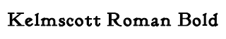
- A basic font for horrors or thrillers as it's simple. It doesn't tell you much lke a trailer for that genre, it likes to keep the audience anticipated and wondering.

- I thought this font could reflect a childrens trailer as the font is spaced out, very clear, written as if a child had written it being different lengths and quite spacious apart. E.g. Daddy Day Care.

- This is the classic love font for a trailer, the swirly writing as if it's a love letter or the thoughts of swirly writing when girls day dream or think. This font reminds me of the film 'Like Crazy' or 'P.S. I Love You'.
Subscribe to:
Posts (Atom)