
This poster has the film title written down the side in capital writing in red, this could resemble blood and death. It stands out from everything as majority of the poster is black. They use the daughter in the background of her in her outfit of when she is being sold to show a part of the film and to remember the audience why her dad is chasing after people. She is faded in the background maybe reflecting his relationship to his daughter fading away and the more time which passes she is becoming more distant. The main picture used is of him running showing what he is mainly doing through out the film.
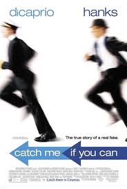

This poster has the actors under their names at the top to show who is in their film. A white background is used and this makes the actors stand out as they are in black suits, Dicaprio in a pilot uniform as that is his "occupation" and Hanks as a investigator. The obvious part of this poster is that they're running to reflect the whole context of the story and to reflect the title. The title is in a arrow pointing the direction of where Dicaprio is running to show he's continuously running. They use a small quote just above the sentence to remember the audience that this story is based on a true event and this dramatises the story and makes it seem more shocking as it's real.

This poster is quite basic, it uses the main character in the film with the actors name at the top of the poster, the colour is white as it stands out and contrasts against her hair colour of black. She looks very mysterious with the dark black eye make up to. They ask a question "who is salt" to make the audience wonder, it's like a rhetorical question. The text font is like a computer font which you see on films when somebody is typing information or a messenger type. Having SALT positioned in the midle of her face and the poster makes it eye catching for the audience.
No comments:
Post a Comment