I asked the same question as I did on the ancillary task to some people, I chose different ages and gender.. here were some of there answers:
David 51: Punchy, Interesting, Speed is good, Maybe some more background information on the kidnapper
Julie 42: I like the way you've done the editing at the start with the facts about kidnapping, the music makes the trailer really tense and builds up suspense
Laura 16: The music is really good in the trailer it's like other proffessional trailers, the idea is really interesting and I like how you leave the message/story hidden, we have to work it out ourself
Tom 19: The storyline is really good and different, the music fits the speed of editing such as the end of the trailer is really interesting as when the character is running the speed of the music and editing builds up too. The black and white theme fits well with it too. Maybe add more scenes with fighting or show where she ends up to give the audience more of a storyline
Tuesday, 16 April 2013
Monday, 15 April 2013
Ancillary Feedback

I like the writing being over the face in the first one cus I've never really seen anything like that and it makes it stand out especially with the background being completely black and that being the only thing there is, and I like the picture of the second one as well - the only thing I would say is more colours in the second one maybe, cus it's a magazine type of thing but they're both really good
I like the picture in the first one as its quite mysterious and interesting to look at with the contrasting background, the second one I like the writing in it but I'd say maybe add a neck to your character as its very small just his head in the corner of it with black background, maybe more color aswell? but apart from that their both good!
They're both quite different yet they connect together and I can see that buy the colours used and the clothes the characters are wearing. With the magazine maybe add more text to show more advertisement like a actual magazine
Thursday, 11 April 2013
Magazine Covers


This was a post I had saved and forgotten to publish.
This is a quick post on magazine covers to give me inspirtation for my Ancillary task. Looking at these covers most of the images are set directly in the centre of the magazine to catch the readers attention. Usually a colour scheme is used for example the Justin Beiber front cover is red green and white. I think I will take this on board and use a colour scheme as it seems to stand out more but look more effective as it links nicely together. The first magazine cover uses this also with black and pink but uses a lot of text making the front cover seem quite caotic but I like the way the important words or phrases are highlighted bold or are bigger so they stand out against everything. But for a magazine cover like Elle, different styles will always be used as it makes it seem more creative and girly. The Celebritys names Drew and Justin on the first two magazine covers are next to the picture of them and in big font to make them stand out so I will take this into account and do it with my film name. The last cover is Vogue. It's really different to the others as it has very little text yet seems really eye catching because of the image and the yellow background as they combine well together. I don't want to use lots of text on my magazine cover as for a magazine company I dont feel it needs too and sometimes can take away the attention from the main meaning.
Monday, 1 April 2013
Mise-en-scene
Mise en scene- the location of my film will be in Bristol but in certain parts such as my house, a road and maybe a city centre to dramatise the trailer and make it seem more realistic.
The main characters are female and male. The male character will be dressed in black and dark colours to show him being mysterious and anonymous where as my other character (a teenage girl) will be dressed in lighter softer colours such as light blues, peaches to reflect a innocent shy personality. I don't want the teenager to have to much makeup on, I want her to look natural to reflect bow she is.
The main characters are female and male. The male character will be dressed in black and dark colours to show him being mysterious and anonymous where as my other character (a teenage girl) will be dressed in lighter softer colours such as light blues, peaches to reflect a innocent shy personality. I don't want the teenager to have to much makeup on, I want her to look natural to reflect bow she is.
Tuesday, 19 March 2013
Genre Theory David Chandler
Types of sub-genre which apply to my trailer would be:
Genre conventions
Fonts - I used black and white colour within my trailer/magazine cover/poster as it's basic and stands out for the audience. When I say basic I mean it connects to my genre/plot. There is nothing special, fancy, funny about my genre so I used a very basic font style. Usually the font arial was used with the transitions so it was easy for the audience to understand but with the poster I used a website called 101 fonts and used an example on their.
Editing Techniques - When editing my piece learning from last year it was to keep the pace of the trailer fast and the shots quick and simple instead of them dragging out. The convention was using dark suspence music to fit into the genre and at the important parts (syntagms) the music would either stop or be very quiet. I slowed down some of the shots such as walking to make more emphasis on them but not too much so they look like a western film creating a comedy impact.
Clothing - The conventions of clothing for a action thriller genre was making sure their clothing was completely opposite to each other. I used dark colours such as black, navy very basic colours for the protagonist and for the teenager/female light blues, whites etc. I wanted clean fresh but dull colours nothing to bright to give away the thought that she's a fun confident teenager as my portray of her isn't meant to be that. Using the colours show the differences between good and bad like Levi Straus theory.
Photographs - The genre convention of my photography which I took for my poster/magazine were using models and I used lighting to create more a dynamic effect and edited it so the background was black or white to connect all together. I made sure they wore clothes which represented their personalities and what they wore in the film so it all connected.
Trope - The other type of genre but within my film is how it connects to another different genre. For example in my film a male who is strong, mysterious wearing black or a suit, in a romance could be the person who everyone wants to be or want to be with. Or in another action film it could be seen as the good, smart, tactical person. Or a sign of a house is usually peace, love, family, friends, emotional etc it's all types of emotions and feelings in one setting but in this trailer this is where the person gets taken and all types of connection are broken.
- Action thriller
- Drama
- Suspense
- Crime
- Mystery
- Pyschological
- Disaster
Genre conventions
Fonts - I used black and white colour within my trailer/magazine cover/poster as it's basic and stands out for the audience. When I say basic I mean it connects to my genre/plot. There is nothing special, fancy, funny about my genre so I used a very basic font style. Usually the font arial was used with the transitions so it was easy for the audience to understand but with the poster I used a website called 101 fonts and used an example on their.
Editing Techniques - When editing my piece learning from last year it was to keep the pace of the trailer fast and the shots quick and simple instead of them dragging out. The convention was using dark suspence music to fit into the genre and at the important parts (syntagms) the music would either stop or be very quiet. I slowed down some of the shots such as walking to make more emphasis on them but not too much so they look like a western film creating a comedy impact.
Clothing - The conventions of clothing for a action thriller genre was making sure their clothing was completely opposite to each other. I used dark colours such as black, navy very basic colours for the protagonist and for the teenager/female light blues, whites etc. I wanted clean fresh but dull colours nothing to bright to give away the thought that she's a fun confident teenager as my portray of her isn't meant to be that. Using the colours show the differences between good and bad like Levi Straus theory.
Photographs - The genre convention of my photography which I took for my poster/magazine were using models and I used lighting to create more a dynamic effect and edited it so the background was black or white to connect all together. I made sure they wore clothes which represented their personalities and what they wore in the film so it all connected.
Trope - The other type of genre but within my film is how it connects to another different genre. For example in my film a male who is strong, mysterious wearing black or a suit, in a romance could be the person who everyone wants to be or want to be with. Or in another action film it could be seen as the good, smart, tactical person. Or a sign of a house is usually peace, love, family, friends, emotional etc it's all types of emotions and feelings in one setting but in this trailer this is where the person gets taken and all types of connection are broken.
Wednesday, 13 March 2013
Syntagm and Paradigm
I tried to understand the words Syntagm and Paradigm and apply them to a scene of a film as with language I personally find it a lot easier.
This is a clip from the film Taken when the daughter of the main character (Liam Neeson) is away and watches her friend get taken from her cousins apartment where they are staying. She knows she is next.
The paradigm is that in this scene there are two very different girls - one is very bubbily, confident, not afraid and the other one is more quiet, observed, content. But these two fall under the same category. The males who kidnap them want them both, even though they are completely different types of people they are still going to be apart of this kidnapping and being sold by these people.
As the scenes are always going back and forward to the scene of Kim hiding from the people who are trying to kidnap her and her dad who is sat down listening, helping her, we know that this is the main focus and syntagam the director wanted the audience to know. There could be many connotations to these clips as even though they follow each other and link together the future thoughts are 'will he get her back?' 'what is going to happen her?' this is what the paradigm of the choice of words tell us and make us think as the viewer. As he explains to her shout "eye colour, hair colour, anything you see"
"I will look for you, I will find you and I will kill you" this sentence is a syntagam as "look, find" (verb), "kill" (object), "you" (the subject) but the choice of paradigms are used for the film to reflect Liam Neesons peformance of being strong, confident, a hero etc. Other choices of words could of been 'hunt', 'see', 'hurt' but those words wouldn't make as a strong impact as hunt could be seen as hunting with animals, hurt isn't as violent and shocking as kill and using the word 'see' gives the connotations he will definitely see him but as he isn't 100% sure he will see him he uses the word look as it'll make the other person be aware now that is someone is looking for him and there is no escape.
The obvious is that in this scene its the clear divsion of female and male. Identifying the paradigm is the feamle and male. If the roles were changed and it was the male being kidnapped by a female it would have completely different connotations and meanings as usually its females who get taken are sold.
Saturday, 9 March 2013
Representation
As I chose my film to be a 15 I think representation is really important.
The representation of gender is really apparent in this film. I used a male protagonist to be the kidnapper as stereotypically that is what happens in the real media. I used certain camera types such as a high angle following him as he is walking to make him seem more intimidating and then with the female: close ups such as on her face to show fear.
Another type of representation is class/social status. My storyline is about tiger kidnapping and he kidnaps for money as he lost everything in a fire. I show this by using transitions throughout the film of facts about tiger kidnapping so the audience know what it's about and get some general knowledge about it.
Friday, 1 March 2013
Music research
I finally picked some music which I liked for my piece. I used the Macs music anyway such as 'dark suspense 1' but I also found on Youtube instrumental pieces.
I downloaded the Taken final fighting scene instrumental as it has some really good drum beats and then a sudden pause which creates a huge amount of suspense and really would make the audience feel 'wow'. I then also downloaded a instrumental piece of a piano song as I was intending to put a sad piece of music in my work but then realised it didn't really connect to the other pieces of music so during the sad points of the trailer I made the music quiet or used a silent piece to cause tension.
I ended up downloading suspense instrumental pieces which I use at the beginning which is a drum beat every 3 seconds, it's great to get the audience intrigued I thought but also during the transitions makes them seem more realistic.
Questions for Myra
http://www.youtube.com/watch?v=sax95YCXQk8
My link for my trailer is ^
Here are some questions Myra I would like you to answer.
My link for my trailer is ^
Here are some questions Myra I would like you to answer.
- What do you think of the pace of the editing throughout the film?
- Do any of my shots need to be cut, longer, changed?
- My shots at the end of my trailer in the night time I tried out night vision as it was too dark otherwise. Do you think it was a good idea or does it not fit my genre very well as usually it's for a horror theme.
- Do you think I should do some background information on the kidnapper before he enters the house and takes the teenager or leave it where is he is seen as anonymous?
- Do you think I could change any of the music or does it fit quite well with the piece such as the drum beat for tension and suspense.
- I go quite quickly from saying the mum is going out tonight so the teenager is going to be alone to the scene where the kidnapper comes in and takes her... Do you think I could add a bit more information in here so it's not jumped straight away or do you think it is okay and builds the tension up quickly?
Thursday, 28 February 2013
Poster - Ancillary Task
Poster -
I will use studio lighting to create a more clearer moody effect and the lighting will be dark to reflect the film and the personality of the protagonist being mysterious and wondering what his motives are. Colours will be dark such as blacks connecting to the shadows and dark lighting.
I think from research and page layout I will use the rule of thirds and have the image to the left and the text to the right as it makes the picture stand out more. The text font colour will be simple such as arial and the colour will be white to stand out against the picture.
The location will be either in a studio or in my house but with a white background so the lighting can bounce on the walls and cause some good shadows.
The piece...
div class="separator" style="clear: both; text-align: center;">

Using a black background made the picture stand out and the text on it. Black and white is a very basic colour scheme. When researching other types of posters which followed my genre they had used black and white. The connotation of this is dark, scary, thriller, evil, anonymous, lifeless.
I took my image mid close up as he was running to get a clear action shot. I wanted the picture to be positioned in the middle of the poster so it was the main focus for the audience to look at, it would work especially with the text focussing around it. His facial expression could have connotations of confusion, anger, focussed as his eyes are set straight forward looking into the camera.
I made sure his clothing was black to blend in with the background but also black/dark clothing have connotations of a dark personality, suspision as if he was a happy good character he could be dressed in colourful clothes - greens, yellow, oranges, light blues and white etc.
I wanted to use just the main character in the poster as it would then lead suspense for the audience to keep wondering what is this film about and as he is the main character it would make more sense. Especially when looking at other posters with a similar plot or genre they use one person as it makes it the main focus. Examples are - Salt or Taken.
I gave a quote from the film over his face to show it came from him, it's faded in which I really liked the effect of as it makes everything seem more mysterious. Using quotes will make the audience more interested and tell them a bit more about the film instead of leaving them clueless.

Tuesday, 26 February 2013
Poster -
I will use studio lighting to create a more clearer moody effect and the lighting will be dark to reflect the film and the personality of the protagonist being mysterious and wondering what his motives are. Colours will be dark such as blacks connecting to the shadows and dark lighting.
I think from research and page layout I will use the rule of thirds and have the image to the left and the text to the right as it makes the picture stand out more. The text font colour will be simple such as arial and the colour will be white to stand out against the picture.
The location will be either in a studio or in my house but with a white background so the lighting can bounce on the walls and cause some good shadows.
Representation
The representation of gender in this film is very apparent and strong. My main protagonist is male and the teenager who he kidnaps is female.
It's stereotypical but works really well as it reflects reality. The male protagonist is seen as strong, dominating and the female is seen as young and vulnerable. This will be shown through their body language and mise-en-scen as it creates a picture for the audience to understand, especially when it's a trailer.
Another representation in the trailer and film is poor and rich/class division. I thought this isn't a clear representation in most films as it seems to be gender or ethnicity etc so I thought it would be interesting to work with. It won't be extremely apparent as working with it would be quite different so I will show it through language and mise-en-scen. Such as the male prognosis losing everything that's why he's kidnapping the teenage girl for money.
Monday, 18 February 2013
New technology
New technology is what makes the world go round, you don't have to be a professional film critic to be able to critic a film or give your opinion. Feedback is mostly used through the Internet as its easier, it's more accessible to people and you can catch up on it whenever. You don't have to worry about pieces of paper or losing it, it's all within a click of a button.
Learning from this, I have been able to portray and learn from this for my practical pieces. I have been able to asses new types of news from the Internet or twitter as people 'trend' words which are associated to a particular topic worldwide.
Learning how to make a poster using professional software such as photoshop. I have learnt this from doing a photography course since gcse but I have adapted and took these techniques to apply to my current work. Photoshop is one of the worlds new favourite technology. Photoshop can change everything, how we perceive each other and life such as the beauty advert done by dove.
Sunday, 13 January 2013
Tuesday, 11 December 2012
Poster and Magazine Shoot


Here on slideshare is multiple images I took for my poster and Magazine shoot.
I took around 30 images but I put different ones on the slideshare as some of them were the same just taken 2/3 times.
http://www.slideshare.net/slideshow/embed_code/16855671"
Compare to AS work
Reflecting on my blog and last years I feel more confident as I have already done most of it so I know what to expect and what to do. I have learnt to be more open and different when looking at audience research/feedback instead of questionares but to do Facebook groups or Talks using speaker phones or videos and upload them onto Youtube.
I am looking at most inspiration such as Trailers and other A2 Media students work to see what they have done which I can inpsire from and learn from.
Good vs Evil
Propps can apply to most film genres, but not necessarily horror films as usually those films want to leave the audience on a cliff hanger and lead to another film but action thrillers such as Spiderman or The Dark Knight always have a villian, hero, the dispatcher, the helper and the princess. My A2 film could apply to this as we have a villian, a innocent girl, a hero, and a helper.
My trailer could also apply to Barthes as there is Action and Enigma but is there a resolution? I want the audience to wonder and try figure out this trailer by themselves without giving anything away to much except the basics.
I am looking at most inspiration such as Trailers and other A2 Media students work to see what they have done which I can inpsire from and learn from.
These are some horror thriller trailers students have done in the past across Britain for their A2 media work.
When applying my AS and A2 work to a theorist it would come under Levi Strauss with the binary opposities.
AS: Life vs Death
Boy vs Girl
Brother vs SisterGood vs Evil
A2: Boy vs Girl
Poor vs Rich
Good vs Evil
Strong vs Weak
Poor vs Rich
Good vs Evil
Strong vs Weak
Angry vs Hapy
Logical vs Emotional
Tough vs GentlePropps can apply to most film genres, but not necessarily horror films as usually those films want to leave the audience on a cliff hanger and lead to another film but action thrillers such as Spiderman or The Dark Knight always have a villian, hero, the dispatcher, the helper and the princess. My A2 film could apply to this as we have a villian, a innocent girl, a hero, and a helper.
My trailer could also apply to Barthes as there is Action and Enigma but is there a resolution? I want the audience to wonder and try figure out this trailer by themselves without giving anything away to much except the basics.
Sunday, 2 December 2012
Flat Plans and Storyboards
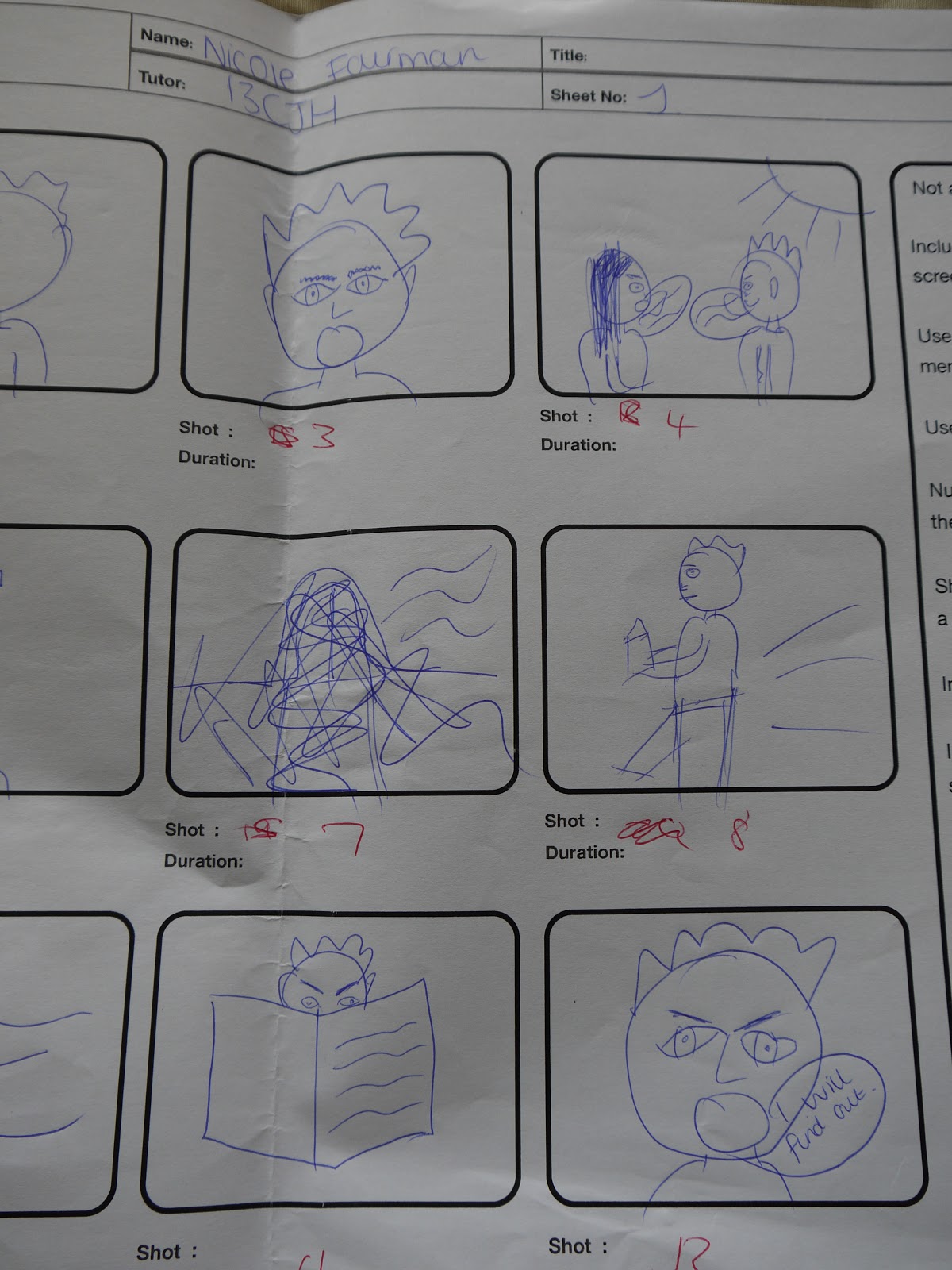
Here is my storyboard which I used slideshare for. I used digtal images with anaylsis of what is going on and how long the cuts are etc...
http://www.slideshare.net/nicolefairman95/story-board-a2-film-trailer
These are some experiments with story boards
1.


http://www.slideshare.net/nicolefairman95/story-board-a2-film-trailer
These are some experiments with story boards
1.


2.

3.


Friday, 30 November 2012
Narrative theorists
During year 13 A2 work we looked at narrative theorists such as Todorov, Roy Stafford, Gill Branston, Propps etc. When looking at what narrative theorist could apply to my trailer I think Roy Stafford could as his theory was looking at not giving away the plot and making the audience think about it. My trailer I want to only give quick shots of the film so it's like a puzzle that the audience have to work out themselves.
Another theorist, I would like to think my trailer/film could follow todorov theory as in having a clear stage of everything is okay at the start, then a problem occurs, then repairing the problem. But I think I want my trailer to tell that so the audience can understand the concept of the film but i will also mislead the audience and make them want to find out more. Wanting them to expect the unexpected.
Another theorist, I would like to think my trailer/film could follow todorov theory as in having a clear stage of everything is okay at the start, then a problem occurs, then repairing the problem. But I think I want my trailer to tell that so the audience can understand the concept of the film but i will also mislead the audience and make them want to find out more. Wanting them to expect the unexpected.
Poster Anaylsis
Looking at inspirations of poster designs for my film here are some posters

This poster has the film title written down the side in capital writing in red, this could resemble blood and death. It stands out from everything as majority of the poster is black. They use the daughter in the background of her in her outfit of when she is being sold to show a part of the film and to remember the audience why her dad is chasing after people. She is faded in the background maybe reflecting his relationship to his daughter fading away and the more time which passes she is becoming more distant. The main picture used is of him running showing what he is mainly doing through out the film.

This poster has the actors under their names at the top to show who is in their film. A white background is used and this makes the actors stand out as they are in black suits, Dicaprio in a pilot uniform as that is his "occupation" and Hanks as a investigator. The obvious part of this poster is that they're running to reflect the whole context of the story and to reflect the title. The title is in a arrow pointing the direction of where Dicaprio is running to show he's continuously running. They use a small quote just above the sentence to remember the audience that this story is based on a true event and this dramatises the story and makes it seem more shocking as it's real.

This poster is quite basic, it uses the main character in the film with the actors name at the top of the poster, the colour is white as it stands out and contrasts against her hair colour of black. She looks very mysterious with the dark black eye make up to. They ask a question "who is salt" to make the audience wonder, it's like a rhetorical question. The text font is like a computer font which you see on films when somebody is typing information or a messenger type. Having SALT positioned in the midle of her face and the poster makes it eye catching for the audience.
Wednesday, 28 November 2012
Characters
I have decided to use a male as my protagonist for my film/trailer and for him to be older as a teenager wouldn't be able to act the way the actor has to for it's role. I decided he isn't going to be shown completely, I like the thought of a hidden identity leaving the audience confused and wondering as that what I think this genre is meant to reflect so my angles and camera shots will be of eyes, hands, arms, back, mouth etc.
My other protagonist is going to be stereotypically a young teenage girl as she is meant to reflect the time period of when he lost her and that was when he was a teenager. I have chosen to work with pictures such as setting up and printing lots of pictures and sticking them on a wall as identity to show that my protagonist has turned slightly obsessive and pyschopathic.
My shots aren't going to be lots of long shots of the characters, I want to keep them anonymous as much as possible but still giving the audience a good amount of knowledge to understand the trailer/future film. By doing this it will be quick shots of feet running, walking, eyes moving, talking lips and then maybe a clip at the end of there actual faces to dramatise and end with a dramatic bit of suspence.
Audience Research
Here is another set of research I did.. http://freeonlinesurveys.com/s.asp?sid=czdewypodw993i9168842
Ideas of venue

This is round the back ends of the mall behind the shops, I work in the mall and would like to do a very quick low angle shot on the floor of feet running and of their backs as this setting looks very plain, quite scary, basic, lots of different routes which can make it chaotic and confusing but one main word is that it looks lost and lonely which is perfect for how I need to make my female character feel and create for the audience.
Font Choice/Graphics
When looking at fonts and studying them from trailers I have noticed black and white are the main colour choices as they contrast, stand out and are bold. There simple yet effective so I will be chosing black and white for my colour scheme.
Fonts seem to be a basic Arial, Tahoma font, nothing swirly, big or bubbly very basic and this is because it's reflecting on the genre of the film. For example a horror, pyschological trailer wouldn't have bubble or swirly writing it wouldn't connect to the story and would confuse the audience.
Swirly font have concepts of a romantic film.
Bubble font have concepts of a childrens film or comedy.
Big bold font have concepts of a comedy.
Basic font have concepts of a horror/thriller/pyscholigcal film.
Halloween style font have concepts of a comedy-horror.
Types of font:

- This font seems to look like this is what would be used on a high school comedy trailer, something bubbily reflecting teenagers and with a sketchy, pencil look as if someone had writen this like a student in class.

- This is a classic American comedy film such as Sex and The City. It's tall reflecting New York such as their buildings, it's simple yet quite elegant and modern reflecting modern stereotypical comedy films.

- A basic font for horrors or thrillers as it's simple. It doesn't tell you much lke a trailer for that genre, it likes to keep the audience anticipated and wondering.

- I thought this font could reflect a childrens trailer as the font is spaced out, very clear, written as if a child had written it being different lengths and quite spacious apart. E.g. Daddy Day Care.

- This is the classic love font for a trailer, the swirly writing as if it's a love letter or the thoughts of swirly writing when girls day dream or think. This font reminds me of the film 'Like Crazy' or 'P.S. I Love You'.
Tuesday, 9 October 2012
Kidnapping
These are some facts about kidnapping, I took the inspiration from the film Taken trailer.
- Criminal gangs are estimated to make up to $500 million a year in ransom payments from kidnapping.
- During the year 1999 in the United States, 203,900 children were reported as the victims of family abductions and 58,200 of non-family abductions.
- Kidnapping has been identified as one source by which terrorists organizations have been known to obtain funding
- Kidnapping seems to flourish particularly in fragile states and conflict countries, as politically motivated militias, organized crime and the drugs mafia fill the vacuum left by government.
- 78% of abductors are the non-custodial parent
- 35% of children were between 6-11 years old
- 24% of the abductions lasted between 1 week and 1 month
- 82% of abductors intended to affect custody permanently
- 21 % are other relatives
- 42% of children were living with a single parent
- 15% were living with another relative/foster parent
- 66% were taken by a male relative
Inspirations
Taken was a huge inspiration for me and is one of my favourite films, so I was really excited when I knew the second one was coming out this month (October). The film is so excellent and has a great plot/story line. I really like the fact it used reality and facts, it took a everyday issue and exposed it which was really upsetting but to me makes it so more interesting and opens knowledge for us the viewers. When films or anything use reality it automatically makes me, myself, interested as I feel you can try to relate it instead of it being a fantasy.
The trailer is so cleverly put together it doesn't reveal to much but does enough so it tells you what it's about. I like how the music goes with the speed of the clips and what is happening in the clip to reflect that. Using black and white basic texts/font also reflects in a way of the reality of the film, that it is very basic and depressing/boring such as Trafficing as that is the reality of it, there is nothing nice about it, nothing can be lied about or dressed up such as the trailer being very basic.
http://itunes.apple.com/us/movie/taken/id312517901
Customer Reviews
INCREDIBLE!!
by Travis Smith
These is an AMAZING movie and it really brought awareness that this crap actually happens (besides it's a great action clip). After so many movies, another one about one guy who is "Invicible" is just...annoying and you have no desire, but this was different. For one Liam Neeson is older, second, the choreography in it was just outstanding and different. It's not your average movie. I HIGHLY reccomend you at least rent it and watch it. ...Amazing.
First Review! And An Amazing Movie
Liam Neeson gives it his all in this movie. It is full of non-stop action and that great edge of your seat feeling. Perfect plot, perfect director, and perfect cast. Worth every penny.
One of the best movies since The Dark Knight
Very good movie, plot, action packed, and original. Just buy the movie. You will not regret it. If there is ever a rate below four stars for this movie, that person is on crack.
Current Releases
Current releases or films released in 2012 with the same genre as my film was a film out in February called Safe House. Safe House is a 2012 action thriller film. A young CIA agent is tasked with looking after a fugitive in a safe house. But when the safe house is attacked, he finds himself on the run with his charge.

Taken 2 currently out at the moment - October. Following the first film.

Jack Reacher is a film out in December 2012 and it is a bit different to my genre as it involves crime/drama but that's always something I would be interested to maybe go into. They both follow the same footpath of it being drama or a thriller. The film is about a homicide investigator digs deeper into a case involving a trained military sniper who shot five random victims.

Deadfall is also out in December about a thriller that follows two siblings who decide to fend for themselves in the wake of a botched casino heist, and their unlikely reunion during another family's Thanksgiving celebration.

Taken 2 currently out at the moment - October. Following the first film.
Deadfall is also out in December about a thriller that follows two siblings who decide to fend for themselves in the wake of a botched casino heist, and their unlikely reunion during another family's Thanksgiving celebration.
What certificate?
The age certificate I would like to give my film/trailer will be a 15. I was debating a 18 but then I would want 16/17 year olds to watch it so if I did a 18 they wouldn't. This means I can include
The reason my film will be a 15 as I will have scenes of violence and abusive words as it reflects my genre and the storyline / plot.
Looking at other films for inspiration I have noticed there 15 or 18, no lower. It depends if you want it quite explicit or dramatic such as scenes of violence. Taken is a 15 with scenes of violence and some nudity which is what I want to follow. It's not just for purposes I would also like to show teenagers and open a wider audience so it can raise awareness.
- Strong violence
- Frequent language
- Nudity
- Brief scenes of sexual violence or verbal references to sexual violence
The reason my film will be a 15 as I will have scenes of violence and abusive words as it reflects my genre and the storyline / plot.
Looking at other films for inspiration I have noticed there 15 or 18, no lower. It depends if you want it quite explicit or dramatic such as scenes of violence. Taken is a 15 with scenes of violence and some nudity which is what I want to follow. It's not just for purposes I would also like to show teenagers and open a wider audience so it can raise awareness.
10 trailers
Taken
This trailer is rougly 2 minutes long but instantly starts with a fact which automatically makes the audience feel more uncomfortable and more upsetting as it uses reality with it's film which will instantly make the film more interesting and catch the viewers attention as using facts which are not positive ones such as 'people being trafficked'. The next clip shows a picture of the girl who get's taken, showing the audience what this film is to do with and who is involved. All the colours used are black, greys, white very dark disieving colours very mysterious and reflecting on the story of the film of it being sad. The music starts with a piano very gently but then moves onto fast paced as the clips get quicker as the action follows. The text is very basic white against black - contrasting colours, making a statement and standing out.
Taken 2
Again following the first film the music starts of very slow paced, making the audience question what is about to happen, it later speeds up following the action then at the end a two-second beat is used against the actors names to emphasis what is happening and who it is - using silence definiely reflects the action. It uses flashbacks from the first film to remember the audience or invite new viewers of what happened using a voice over to recap what happened. The text is basic again, white against black and standing out. The colours of the country used and of the good characters such as the daughter (her being the victim) is dressed in creams, beiges, where as the 'bad' characters are the stereotypical colours of black, navy and white.
Transporter 3
Roughly 2 minutes - same as taken. The clip introduces the action straight away grabbing the audiences attention and reflecting back to the previous films. Using clips of the main characters body grabs female attention to show this isn't just a male audience only film. The text is very different to Taken it's more colourful and effective and uses a wheel as the background of the text reflecting back to the main story of him always using his car and being a brilliant driver or fast shots of a place moving as if you were in a car. A rock/punk band is used in the background of the trailer to add tension.
Salt
Salt is definately contrasting against stereotypical action films of the main protagonist being male but in this case in this film it is a woman attracting a different audience and using a famous woman actress. She is a typical blonde female using male attraction and stands out from all the other charatcers who are dressed in black/dark colours. The trailer is just under 2 minutes. The trailer uses numerous shots but keeps referring back to the interview room to remember the audience what is happening. The text is basic using capital letters to stand out and uses a black background with silver font which makes it seem quite technical but also maybe quite glamorous as that is the portray she is giving.
Casino Royale
This trailer goes on for over 2 minutes which is quite long in contrast to the other films this is because they want to show as much action as they can to get the viewer interested in the film and wanting to watch more, especially as James Bond/007 has been round for years they want to keep their audences interested. They use black and white at the start of the film to begin with reflecting old-fashioned times as the story has been round for years and also black and white can look quite posh. The colours in the clip are all blues, whites, blacks, very glamorous shots portraying the perfect lifestyle he has and also using a main female/male character attracts both genders to watch. The music is the famous 'James Bond' theme tune reflecting back to past movies. The font is a posh syle reflecting and representing the lifestyle the main character has and uses blue against white showing class, posh colours.
Stolen
This trailer has similarites to the film Taken. This trailer uses a voice over to explain the story and the drama. The music is a constant beat reflecting on the time of the clips or action. It's out in 2012 and on the trailer at the end uses a hashtag '#' reflecting twitter being a trend so it's using modern technology for it to be heard about as you can get it trending. The colours are greys, black and silvers again dominant colours as you wouldn't expect pink. They start the trailer with a lot of action and end the clip with a lot of action remembering the audience what it's about and representing the genre or it being a thriller, action film.
Seeking Justice
This trailer is a thriller action film and lasts 2 minutes the average timing of a action thriller trailer. the trailer at the start is quite misleading starting with a romantic scene between a couple and it's their anniversary. Their is a guitar playing in the background and the colours of browns and dark lighting casting shadows, quite intimate then completely contrasts with the next scene where she gets shot, the camera work of her feet the close up of her face. The colours are very dark with a spotlight of a street lamp which adds to the effect. This suddenly changes and throughout the trailer there is a constant diegetic sound which builds the tension, a voice over is used on the clips which is quite common to explain the story line without giving away to much information but still showing scenes of the film. Near the end of the trailer the music becomes much more dramatic to add to the dramatic shots and the most vital scene of the gun shot it goes silent to dramatise it. The font colours are yellow and black with big block font in capitals.
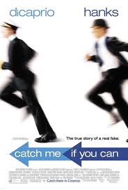
Catch Me If You Can
This trailer is very different to other thriller trailers but I liked it as it was different to others yet still has the context of mind games and running away and keeping the audience anticipated. The film context throughout is set with a very happy old fashioned tone, the outfits, the colours, the music is very cheerful to represent this perfect lifestyle this man has but throughout these clips they use text to show what actually is happening and that his whole life is a lie, the text is black and white very basic showing that his life without all these lies is basic. It's a very light hearted comedy as even though the police are after him they seem to use cheerful music and at the end a old-fashioned song to represent his life of being a pilot. The text of his name and the title is flown into the screen like a metaphor of his life of him always running away. The film is around 2.30-3 minutes, it's a lot longer than other trailers and they give out a lot of information in this trailer.
The Dark Knight Rises
I think this is such a good trailer for a action thriller as it has the right ingredients to make it. The trailer starts with a young boy singing which is very misleading but the boys voice is used over clips of the film which dramatises it and makes the audience think why is this being done. The running scene on the pitch is brilliant as it all becomes silent emphasising what is happening as it will make the audience think "how is that happening?" "why?". The colours are very contrasting such as yellows and blacks for good and evil. A voice over is used explaining what is happening by cat woman then we see at the end cat woman and batman and it all links together what is happening. A ... is used with the chants of the crowd at the statdium and ... group of people who he works with. The text is black and white and when it tells the audience which actors are in this film and the title, the dramatic music is used to emphasis the tension.
Summary of film/genre
My trailer I want to do for my A2 work is going to include a thriller, horror, action genre and my inspirations have come from films like Taken.
My film plots have changed throughout A2, I knew I always wanted to do a thriller/action as I love those films and think they're great as they are interesting, mysterious, deceiving and make you think about the plot, make you work it out.
My plot is the protagonist (male) his house was burnt down as a child and lost this family and all of his personal belongings, the protagonist spots a girl who has it all, a family, a big house, money and gets very jealous/envious and kidnaps her, the only way he will give her back will be in exchange for a numerous amount of money for their will be consequences..
This is called Tiger kidnapping.
Subscribe to:
Comments (Atom)